There are so many resources to help you design a logo out there that you can easily begin to feel stressed and overwhelmed. You might need some guidance to understand which ideas are the ones you need to stick to, and that's exactly our goal with this article.
Adopting the designer mindset
The process of designing a logo requires some previous preparation. When we design for a client, the first thing we need to know is what their business/blog deals with.
We must not design for our client, but for our client’s clients. And if you are creating this logo for your own personal brand, make sure to apply the same thought process. This is a key thought: this graphic piece is largely about your audience.
Sometimes a client will come and ask me to create a logo, and you can bet that 99% of the time he'll want his logo to please him first. This is a mistake. Through his visual symbols, he has to attract costumers and, in order to do so, he has to know them well. Our job as designers is to discover their graphic preferences. I often find that these end users don't feel attracted to the graphic style my client likes. What to do then? Research is the answer. We have to find out which style his clients are going to fall in love with.
Do you own a blog? Then think about who your readers are and design your brand for them. Do you sell something? Think first about who your clients are before you begin to design a brand for them. The aesthetics of your brand (and your logo), have to be aligned with the graphic universe that will attract the kind of client you want to communicate with.
Discover your blog's aesthetic
Once you have a clear idea of who is reading your blog (or who do you intend to be the readers of your blog to be), the second step is to start thinking about the look and feel they would enjoy.
Is your blog filled with whimsical cupcakes or do you sell ecologic products? Do you run a premium fashion brand or are you writing a personal blog? Are your posts funny, dynamic and colorful, or calm and serene?
You have to discover the aesthetics and graphics that match these feelings. Sounds difficult?
Use moodboards
It’s not so difficult; in fact, it's quite fun. You are going to recognize these graphic feelings when you’ll see them reflected all together in one place. This place is a moodboard. You can create a Pinterest moodboard by gathering images, color palettes, and typography ideas together. Collect graphics your clients will feel identified with. An advantage of using Pinterest is that you can browse through moodboards that already exist:
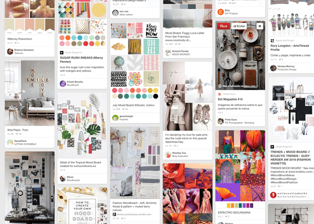
Not pinning? You can simply paste these images together in a collage made with your favorite graphic application, like Photoshop, or maybe an online application like Niice.
Time to start designing
Now you have a bunch of typography ideas, color palettes, and images that will communicate your desired look.
Let’s think about what a logo is for a second. A logo is only a part of a brand. You are going to build up your graphic universe drawing inspiration from all the graphics on your moodboard.
The colors you are going to choose will be applied across the board in your brand's graphics. The fonts you are going to use will make your style recognizable as long as you stick to them consistently. The brand will be better known for the feeling that you create with the use of its graphic universe than for its logo. In the end, it will all work as a whole.
Your logo is the essence and starting point of this whole system.
Knowing this removes some stress from the responsibility of designing a logo. Your logo doesn't have to bear all the weight of your corporate image (or personal image). It’s just a part. If you make a good job with the moodboard, you’ll have made a lot of important brand decisions.
Let’s design!
I know you aren’t a professional designer. This is a simplified step-by-step process I’ve created specifically for you. There are many other approaches to making a logo, but this simple process will help you shape a strong visual character and make design decisions.
So, what are the principles that a good logo has to satisfy?
- It must be easily recognizable.
- Its graphic style has to be definite and clear. It can’t be confusing.
- It must be readable. If reduced, it must still be readable. There may be a simplified version ready for when it has to be shown at very small size.
- You should be able to print it in one color. Nowadays you can have a logo that will never be printed in a one-color publication, but it is still a best practice to bear in mind.
A professional, seasoned designer can be asked for relevancy and impact, but these characteristics require more training.
The starting point: style
Simple or decorative? Distressed or clean? Popular or premium? Do you want to transmit something new and futuristic? Or something retro and connected with the old days?
This choice has to be driven by the graphic vision you have previously decided.
Newness is connected a with simple, synthetic look. Age is related to vintage, historical graphic trends such as characteristic fonts, ligatures, even some decorative elements.
Just take a look at any logo selection (I recommend that you take a look at this) just to get a feel for what I'm explaining here. Educating your taste is essential!
No matter which style you choose, this is the one rule you have to follow:simplicity.
Simple is a must for all of us, but if you are not a professional designer, I’d say that simple is the only way. And simple is definitely not boring!
Adding special elements
One question that I often ask my clients in the briefing questionnaire is if is there's a graphic element that they think is important for them. Some kind of symbol that they think should show in their image. Sometimes you meet someone that has always felt strongly identified with some little animal or symbol and these can be a great starting point.
I want you to think about this for a moment: if you choose a graphic element to work with, it doesn't have to be a drawing that literally describes what you do. For instance: you don’t have to add a brush, scissors and a ruler to your logo to show that you are a crafter.
Find new ways to illustrate your work. The logo you are going to create is going to represent you. It doesn’t have to describe you — at least not explicitly. We are working on the graphics that will symbolize your brand. Mind you, a logo can be a big simple dot if you decide that's the best way to represent your business.
Colors
Stick to two colors to begin with. One will be the dominant tone, and could be vibrant if this matches your brand brief. Number two will be secondary, and you can go with a more neutral or muted hue. Another option is to choose a lighter or darker version of the main color. This way we would have two variations of the same color.
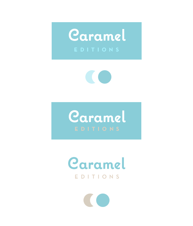
With this simplified choice one color highlights and the second adds contrast and support in the background. If two colors are shouting at the same time, it will be very difficult to look at the logo with serenity! Our eyes like to find order and balance.
Selecting fonts
Same principle here. Start with two fonts where one is the highlight and the other is the complement. One has to be the characteristic, recognizable one. If you want to show a particular brand style, use a font that has that style. This principal font should be accompanied by a very simple secondary font.
Some general rules are:
- Never combine two decorative or intricate fonts. You have to be very experienced to do it well. A good recipe is to mix an intricate/ornate font with a simple one.
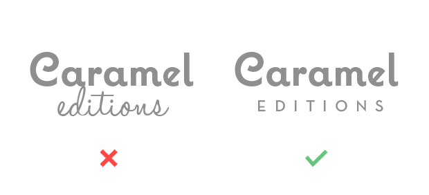
- You're better off not combining two serif fonts. Choose one with serifs and the other one without to create diversity.
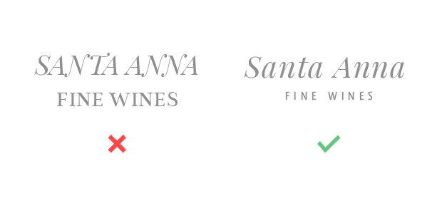
- It’s safer to combine two uppercase fonts than two lowercase fonts
- It’s easier to mix one uppercase with one lowercase.
- Use contrast: make one bolder than the other, or one taller than the other. Try to make these contrasts clear and decided.
- It’s not necessary to choose your colors before your fonts. Sometimes there is something that comes first or that you clearly know that is going to be in your brand. Take this as your first element and create your design around it. It could be a certain typography, a color or a particular image as I explained before.
Composition basics
Composition is related to the way in which you arrange and size your logo elements. You may want to compose two lines of text, or a line of text and image, or two lines and one image.
Please keep the following in mind: No matter how many elements (hopefully just two or three) you have to compose with, you have to choose one to be the main one.
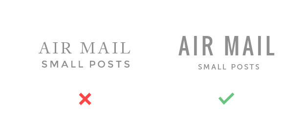
In order to be perceived as the main one, you have to make it clear by giving it a bigger size in comparison with the rest. This main element could be the image or the title. The rest are subordinate and this has to be clear at first sight. Avoid making one element slightly bigger than the other; this is uncomfortable and confusing to see.
For example, if you set the image as main element, make the text the secondary one. If the image is the star, don’t add complex typography to rival with it. Let the image shine and make text the complement.
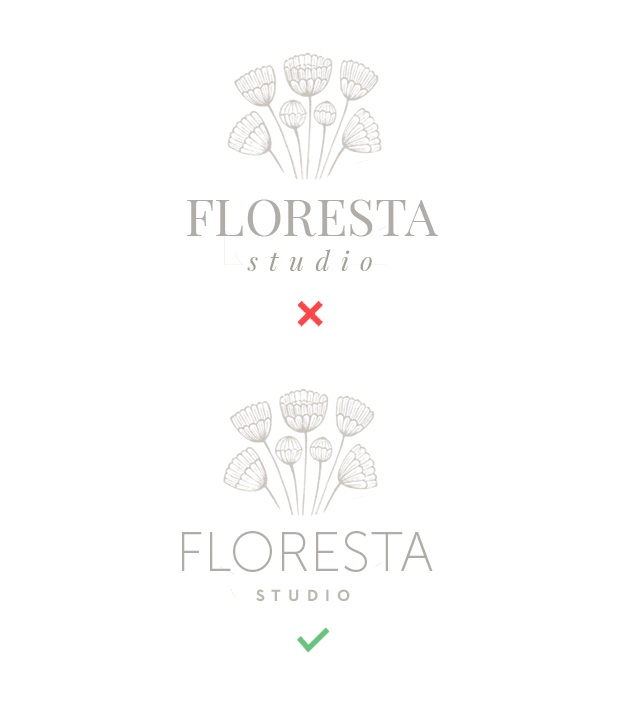
I recommend making compositions with all the elements in gray or any other neutral color, so that you can focus all of your attention on sizing and placement.
All together now
Once we've finalized our composition, it’s much easier to play around with colors. If you add the main color to the main element, it will be further reinforced. Your tone selection depends on how much you want to emphasize any particular piece. You can even use the two techniques together.
In this example, I didn’t want to highlight the image too much so I did it with the title. One solution is to use the main color to make the title pop out.
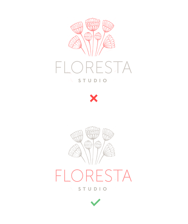
You have to think of sizes and colors as control regulators to highlight the main element, and then assign the secondaries to support it.
Train your eye!
One thing I cannot emphasize enough is that we must train and educate our visual criterion. There are too many examples of bad logo design quality around. To educate our judgment is the only way to tell the good from the not-so-good. Whenever you can, consult graphic design books or professional digital publications instead of internet users' random logo selections.
Products Seen In This Post: